
We will introduce various features that can be used in detailed reports.
KPI Comparison (Bubble Chart) is a report that can analyze three indicators.
The horizontal axis represents the number of visitors, the size of the bubble represents sales, and the vertical axis can be freely selected.
The bubble chart is composed of four areas divided by a central cross.
Bubbles belonging to each area are colored according to the conditions of that area.
*In the image below, the area range is colored for explanatory purposes, but in reality, the color of the bubbles changes.
You can select the group to display (area, store, AM, etc.) from the banner at the top right of the graph.
① Region Comparison: In region comparison, two areas, [East Japan] and [West Japan], can be compared.
② Area Comparison: In area comparison, up to 8 areas such as [Kanto], [Kinki], [Tohoku] can be compared.
③ Store Comparison: In store comparison, it is possible to compare all the stores you use.
④ Common Group Comparison: In common group comparison, it is possible to compare by store format.
⑤ AM Comparison: In AM comparison, it is possible to compare by area manager.
In the table, it is possible to check the daily actual values side by side within the selected period.
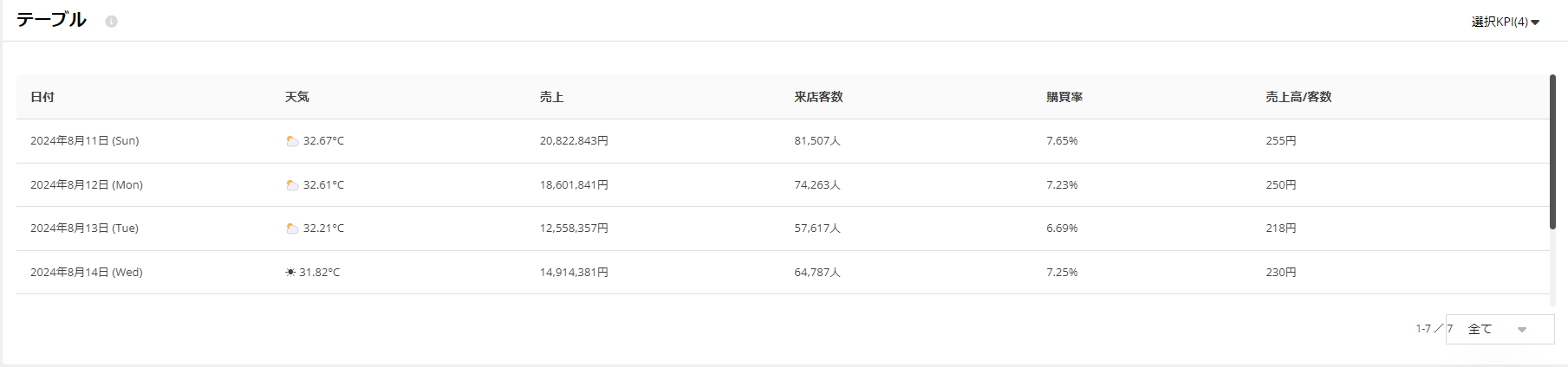
Sorting Function
When you hover the cursor over the right side of each item name, you can select the sorting of that item.
(↑: Ascending ↓: Descending) is possible.

Specify the number of rows to display
To select the number of rows to display on the table, you can choose from [Rows per page] at the bottom right of the screen. By increasing the number of rows, you can check more KPIs side by side.
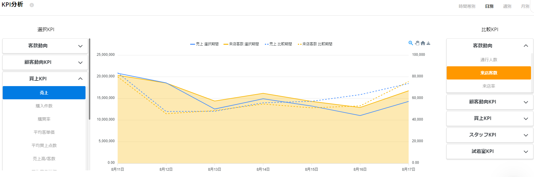
In KPI analysis, it is possible to display and compare two different KPIs on two axes (left and right axes).
You can change the time series within the selected period to hourly, daily, weekly, or monthly.
Let's analyze how the fluctuations of the two KPIs change over time and identify any trends.
[Flow Classic] Characteristics of your store as seen through KPI comparison
On this page, we introduce examples of using 'KPI Analysis' within detailed analysis.
[Flow Classic] Detailed analysis: viewing the correlation between each KPI in KPI analysis
We will guide you on how to understand the relationship between each KPI and increase the specificity of your measures.
If you have any questions or feedback, please contact support at [email protected].
