Overview
Each KPI is closely linked, and focusing on one KPI may likely affect another. In this article, we will review examples of correlations between representative KPIs and ensure that we can take the correct actions when KPIs fluctuate.
Figure ① (KPI Tree)
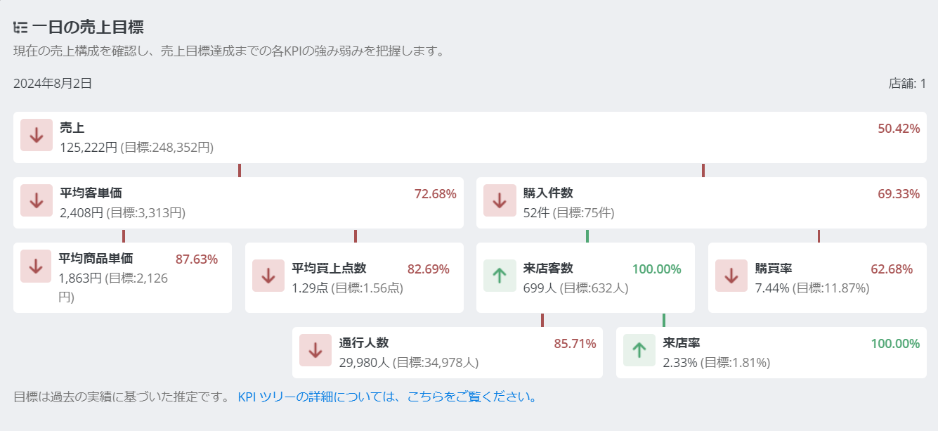
As shown in Figure ①, each KPI branches into related KPIs to form sales.
However, even KPIs that are not directly linked may exhibit specific changes as a trend, so we will guide you through this.
・Number of Visitors ✕ Purchase Rate
As the number of visitors increases, staff may not be able to keep up, leading to a tendency for the purchase rate to decrease.
・Number of Visitors ✕ Sales
As the number of visitors increases, the chances of making a purchase increase, leading to a tendency for sales to rise.
・Average Purchase Value ✕ Purchase Rate
The higher the customer unit price, the longer the customer response time, and the lower the purchase rate tends to be.
・Product unit price ✕ Number of items purchased
There is a tendency for the product unit price and the number of items purchased to be inversely proportional. When one increases, the other tends to decrease.
・In-store stay time ✕ Visit rate
The longer the in-store stay time, the lower the customer's wariness, and the visit rate tends to increase.
Figure ②

As shown in Figure ②, it is possible to understand the fluctuations of each KPI value at each time zone, and it is also possible to discover the correlation of each KPI.
When set by [time zone], if you select the calendar filter for one week, the average value will be reflected in the graph, and if you select the current day, you can understand and evaluate the changes of the day in real time.
(※According to the company's POS register data sharing system.)
An example of a usage scenario is when the goal is to increase the average customer spend, but sales growth cannot be expected unless the purchase rate is also maintained. In such cases, it is advisable to evaluate and improve daily actions every hour while checking the graph, and to make behavioral adjustments.
Figure ③

As shown in Figure ③, it is possible to compare and analyze a specific period with other nearby periods and the previous year.
An example of a usage scenario is to implement measures during a specific period and check the changes in numbers compared to the previous week using a graph. By being aware of the changed numbers in the following week as well, you can improve the quality of measures and actions, and ultimately discover the relationship between KPIs and market changes due to the measures by comparing and analyzing the effectiveness of the final measures and actions with each KPI.
An example of a usage scenario is implementing a campaign in recent times when the purchase rate is on a declining trend, aiming to increase the purchase rate. The effectiveness is then verified by comparing the differences before and after, to examine if there is a cost-effectiveness.