
Each KPI is closely linked — focusing on one KPI can affect another. This article walks through examples of correlations between common KPIs, so you can take the right action when a KPI shifts.
Figure ① (KPI Tree)
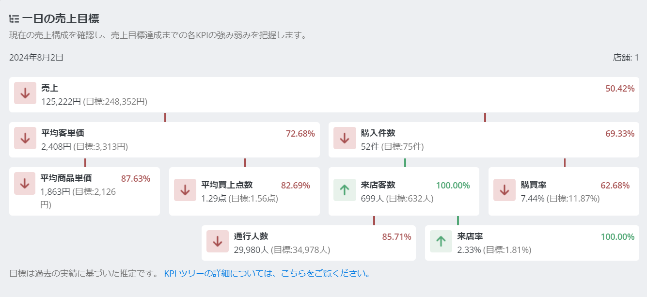
As Figure ① shows, KPIs branch off from and relate to each other to make up sales. Even KPIs that aren't directly connected can show a consistent pattern of change together. Some common examples:
KPI pair | Tendency |
|---|---|
Visitors × Conversion rate | As visitor count rises, staff may not keep pace, and conversion rate tends to drop. |
Visitors × Sales | As visitor count rises, there are more chances to make a sale, so sales tend to rise. |
Average spend × Conversion rate | Higher average spend tends to mean longer customer interactions, which can lower conversion rate. |
Item price × Items per purchase | Item price and items per purchase tend to move inversely — as one rises, the other tends to fall. |
Time in store × Visit rate | The longer customers spend in-store, the more their guard drops, and visit rate tends to rise. |
You can see how each KPI's numbers change by time of day, which can also reveal correlations between KPIs.
When set to [By Time of Day], selecting a one-week range in the calendar filter shows averaged values on the graph, and selecting today shows the day's changes in real time. (*Depends on your company's POS data-sharing setup.)
Example: if your goal is to raise average spend, but sales won't grow unless conversion rate holds steady too, check the graph and evaluate/adjust your actions hour by hour throughout the day.
You can compare and analyze a specific period against a nearby period or the same period last year.
Example 1: run a promotion during a specific period, then check the change vs. the previous week on the graph. Keep watching the following week's numbers too, refining your actions as you go — comparing the final results against each KPI can reveal both the KPI relationships and the market shift the promotion caused.
Example 2: run a campaign to lift a declining conversion rate, then compare the numbers before and after to check whether it paid off.
If you have any questions or feedback, please contact support at [email protected].
