On the home page, you can view a dashboard that lists each KPI and check the KPI comparison (bubble chart) of store comparison graphs.
In the retail industry, it is also expressed as [budget], and we display the sales targets for today, this week, and this month.
If sales data is also imported at the same time, you can check the progress and achievement rate.
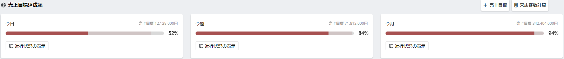
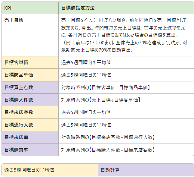
Based on the sales progress of the previous year, we calculate the target values when applied to the sales targets for each weekday of the month.
Example: Sales by 1:00 PM on April 10 of the previous year had achieved 40% of the day's sales.
→If the budget for the same day of the week this year is ¥200,000, the sales target value by 13:00 is
200,000×0.4=¥80,000
¥80,000 is displayed as the sales target value to be achieved by 13:00 on the day.

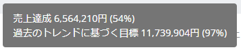
If the sales target is not incorporated, the data from the same day of the week, same week, and same month of the previous year
is displayed as the expected sales target.
Based on the expected sales target, a [target based on past trends] is also calculated and displayed.

You can now determine if the graph bar color indicates performance above the previous year.
If the progress rate is below the previous year = Red

If the progress rate is above the previous year = Green


① Actual Value: Represents the actual values for the range specified in the period selection.
② Comparison Period Actual: Represents the actual values within the selected comparison period.
③ Comparison Period Ratio: Represents the ratio of the selected period to the comparison period as a percentage or actual value.

By clicking the KPI box, you can display a time series graph for the range specified in the period selection, as shown in the image above.
① Trend of Selected Period: Represents the trend of the selected period with a blue line graph.
② Trend of Comparison Period: Displays the trend of the comparison period with a dotted line graph.
※ If only one day is selected for the period, a graph by time zone will be displayed.
Performance Analysis Using KPI Box
This page introduces examples of data analysis possible with Flow's dashboard.
This is a tree representation of how each KPI (Key Performance Indicator) is related and connects to the KGI (Key Goal Indicator).
It helps the entire store understand which KPIs need improvement to achieve the KGI.

By default, the KPI tree for 【Today】 【This Week】 【This Month】 is displayed based on each target sales.
The target values for each KPI are automatically calculated according to the progress of the target sales.
The method for calculating the target KPIs is specified below.
*As a new development, we will report to you as soon as the preparation for guidance is complete. (August 2024)
Based on the Flow Assistant, action proposals are displayed from the most recently received data fluctuation alerts.
*Viewable only by store accounts.

Flow Assistant
This page introduces the Assistant that can automatically send messages based on the measured data.
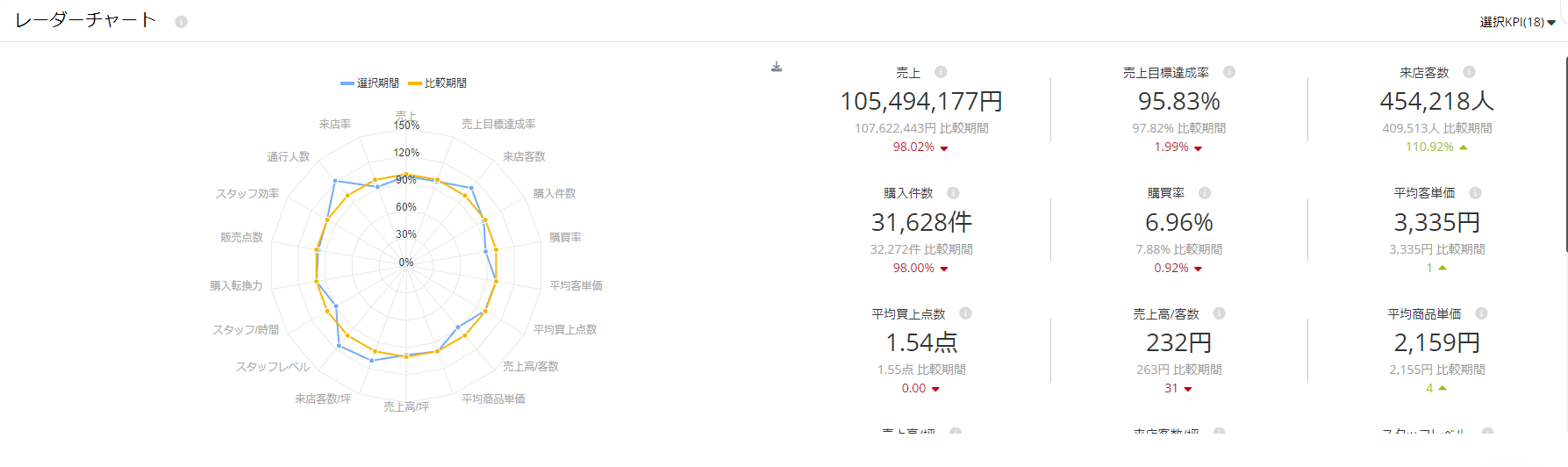
The radar chart allows you to check the data of each indicator within the range specified by the period selection on a radar graph.
You can instantly check the status of the selected store at a glance, and immediately determine the status of KPIs and what needs to be done.
This is expected to be clearly recognized by all personnel and positions.
You can specify the selection of each KPI to be displayed on the radar chart from [Select KPI] at the top right of the report. Click the checkbox to select show/hide.
In addition, the number of selected KPIs is displayed (number) next to [Select KPI].

If you want to save the radar chart as an image, click the download button in the red frame in the image above and select the download format.
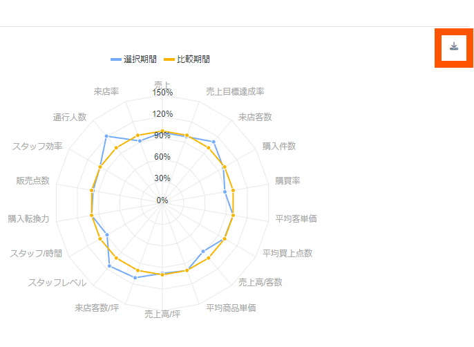
SVG: The quality does not deteriorate even when scaled.
PNG: Can be kept with a transparent background, but the quality deteriorates when enlarged.
CSV: You can download a spreadsheet tool file.
Identify Improvement Points from Radar Chart
We will guide you on efficient data sharing methods using radar charts.
We support the automation of data import to Flow.
For more details, please contact us from the link below.
That's all. If you have any further questions or issues,
please use the chat within the Flow site/app or [email protected]